 Birch Bay
 Why Color Choice Is a Bigger Decision Here Than It Looks
Picking a siding color feels like the fun part of a project, and it should be. But in Birch Bay, color isn't just an aesthetic choice — it's a performance choice. Salt air off the Strait, driving rain that comes in sideways more often than straight down, and a moss season that can stretch from October into May all put real stress on a painted surface. A color that looks sharp on a sample chip in a showroom can look chalky, streaked, or mildew-dulled within a few years if the finish underneath it isn't built for this environment. That's the piece homeowners often don't think about until they're standing in front of a faded south wall wondering what happened.
This guide walks through how James Hardie's factory color system actually works, which color families tend to perform and age well on Whatcom County homes, and what to watch for so the color you pick today still looks right in fifteen years.
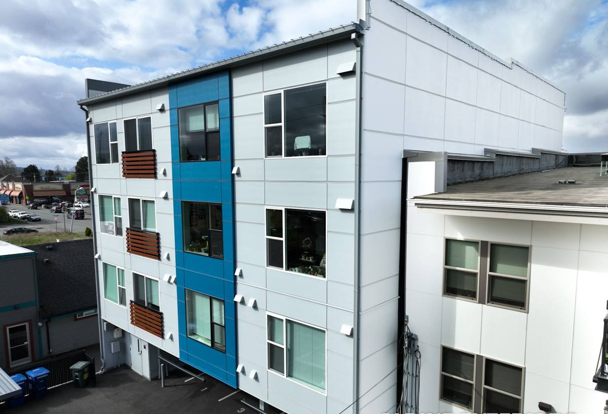
ColorPlus Technology: Baked-On, Not Brushed-On
Most fiber cement and wood siding on the market is either sold unfinished (primed) or field-painted after installation. James Hardie's ColorPlus line is different — the color is applied and cured at the factory in a controlled environment, using multiple coats and a baking process that bonds the finish to the fiber cement substrate. That matters for a few practical reasons:
- The finish cures uniformly, with no thin spots, drips, or lap marks that happen with a painter working outdoors on a ladder
- Color consistency from board to board is tighter than what field painting can achieve, especially across a multi-day install
- The cured finish resists fading, chipping, and moisture intrusion better than a standard field-applied coat, which is the main reason it carries its own separate finish warranty
- Touch-up product is color-matched and sold specifically for ColorPlus repairs, so small dings don't turn into a mismatched patch
Primed Hardie boards can still be field-painted if a homeowner wants a fully custom, non-catalog color, but that shifts the durability and warranty picture back onto the paint job and the painter's skill — which is exactly the variable ColorPlus was built to remove.
How the Palette Is Organized
James Hardie's ColorPlus palette isn't one giant list — it's organized into groups based on tone and intended use, which makes it easier to narrow down rather than scrolling through forty swatches at random.
| Palette Group | General Character | Common Use on a Home |
|---|---|---|
| Neutrals & Warm Whites | Soft whites, creams, warm grays | Full-field color on traditional and craftsman-style homes |
| Cool Grays & Blues | Slate, storm gray, muted blue-gray | Coastal and modern builds; pairs well with black or bronze windows |
| Deep & Statement Tones | Charcoal, deep navy, forest, black | Accent walls, gables, or single-story homes wanting a bolder look |
| Earth Tones | Tan, greige, warm brown | Homes set against timber and evergreen backdrops |
Trim and accent colors are typically chosen from a smaller, complementary palette designed to pair with the field color group — white and warm-white trims are the most common pairing regardless of the main color chosen, since they read clean against nearly everything.
Matching Color to Birch Bay's Light and Landscape
Marine climates change how color reads outdoors. Overcast skies, which dominate a good chunk of the year here, soften contrast and mute saturation — a color that looks vivid on a sunny sample board can look flat and gray under Birch Bay's typical cloud cover, while it snaps back to life on the handful of bright days. A few things worth knowing before committing:
Cooler light favors certain undertones
Colors with warm undertones (soft tans, warm whites) tend to hold visual warmth even under gray skies, while true cool grays can occasionally read a bit flat on overcast days. Neither is wrong — it's a matter of what look a homeowner wants on a cloudy Tuesday in February versus a clear July afternoon.
Greenery and moss context
Many Birch Bay lots sit against evergreen tree lines, and moss and lichen growth on roofs, fences, and hardscaping is a normal part of the local landscape. Deep greens and earth tones tend to blend into that backdrop, while whites, grays, and blues tend to stand out and read as more "finished" against the same greenery — worth considering if the goal is for the home to pop rather than recede.
Salt air and surface dulling
Salt spray carried on wind off the water can leave a fine residue on exterior surfaces over time, which shows up faster and more visibly on very dark, glossy-leaning finishes than on mid-tone or matte finishes. This isn't unique to Hardie — it affects any exterior surface near the water — but it's a reason we talk color sheen and tone with clients on close-in coastal lots, not just hue.
Where Color Meets Product Line
Color isn't chosen in isolation from the product line — the two decisions happen together. James Hardie's HZ5 product line is engineered specifically for climates with significant moisture exposure, which fits Whatcom County's rainfall pattern well, and it's available across the panel styles most homeowners choose between:
- Lap siding — the classic horizontal board look, available in smooth or cedar-textured finish, the most common choice for full-home coverage
- Shingle-style panels — used for gable accents or a full shingled elevation, often paired with a contrasting lap field color
- Vertical panel siding — common on modern builds and porch or entry accents
- Trim boards — used around windows, doors, corners, and fascia, almost always in a coordinating trim color
Texture affects how color reads, too. A cedar-textured lap in a deep tone will show subtle shadow lines under raking light that a smooth panel in the same color won't — a small detail, but it changes the finished look more than most homeowners expect from a swatch alone.
Using Trim and Accent Color Well
The biggest visual mistakes we see aren't bad color choices in isolation — they're color combinations that fight each other. A few practical guidelines that hold up across most home styles:
- Keep trim lighter than the field color on traditional home styles; it reads as clean detailing rather than a competing color
- Reserve the deepest tones in the palette for single accent elements — a gable, an entry wall, a garage face — rather than an entire home, unless that bold full-coverage look is specifically the goal
- Match window and door frame color (black, bronze, white) to the trim decision before finalizing field color, since the three need to work together
- Consider roof color as a fixed constraint — it's the one exterior color that isn't changing, so field siding color should complement it, not clash with it
Maintenance: What ColorPlus Saves You From
The real value of a factory-cured finish shows up years down the road, not on install day. Field-painted siding — whether that's primed fiber cement, cedar, or spruce trim — needs repainting on a cycle, typically somewhere in the 5-10 year range depending on exposure, and Birch Bay's driving rain and salt air tend to push that cycle toward the shorter end on south- and west-facing walls. ColorPlus-finished Hardie is designed to go much longer before it needs attention, which is a real cost difference over the life of the siding, not just a convenience.
That said, "low maintenance" doesn't mean "no maintenance." A short seasonal routine keeps a ColorPlus finish looking like day one:
- Rinse siding with a garden hose (not a pressure washer aimed directly at seams) once or twice a year to clear salt residue and moss spores before they take hold
- Keep gutters clear so overflow doesn't streak down the field color repeatedly in the same spot
- Trim back vegetation that holds moisture against the siding surface
- Touch up any chips or scrapes promptly with color-matched ColorPlus touch-up paint rather than leaving bare fiber cement exposed
- Have caulked joints and seams inspected every few years — the finish resists fading, but a failed caulk joint behind it can still let moisture in
What Correct Installation Protects
Color and finish quality only matter if the installation underneath is right. Fastener placement, joint flashing, and caulking at seams all affect whether moisture ever gets behind the panel — and moisture behind a panel will eventually show up as a stain or bubble on the finish, regardless of how good that finish is. This is also where warranty coverage lives: James Hardie's product and finish warranties are structured around the assumption that the siding was installed to their specification, and gaps in installation are the most common reason a warranty claim gets complicated. Choosing the color is the easy part — choosing an installer who follows manufacturer spec on fastening, clearances, and flashing is what actually protects that color for the long run.
Cost Factors Worth Knowing Upfront
| Factor | How It Affects the Project |
|---|---|
| ColorPlus vs. primed + field paint | ColorPlus carries a material premium but removes a recurring repaint cost and labor |
| Number of colors/products used | Multi-color schemes with lap, shingle, and trim in different colors add material SKUs and install time |
| Texture selection | Cedar-textured panels typically run close to smooth in price; the choice is aesthetic, not cost-driven |
| Home exposure and elevation count | South- and west-facing walls exposed to driving rain may warrant closer attention to flashing detail, which affects labor |
| Existing siding removal | Tear-off of old cedar, vinyl, or damaged material affects total project scope independent of color choice |
Getting the Color Decision Right
The best way to choose a color is to see full-size samples on the actual home, in actual Birch Bay light, at different times of day — not just a paint chip under indoor lighting. Colors shift more than people expect once they're seen against real siding texture, real trim, and real sky. We bring physical samples to every estimate for exactly that reason.
If you're weighing colors, product lines, or just want a straight answer on what would hold up best on your specific elevation and exposure, we're happy to walk the property with you. Reach out for a free, no-pressure estimate — there's no obligation, and it's the fastest way to see real samples against your own home.